When I was young and just taking photography seriously, I got a 4 x 5 view camera, and then for several years I only used that. Working with a view camera, you look at the composition on the ground glass before inserting the film holder, under a dark cloth. You get behind the camera and under the cloth, and the image is upside down and backwards, glowing on the glass. The whole experience is an abstraction. It’s no longer a sense of “There is a thing in front of my camera, and I will capture it.” (Of course one was never going to capture the thing, and photography is always working with an abstraction). But with the view camera, the picture upside down and backwards, the feeling is much more “There are forms and tones and textures on this glass glowing here in the dark.”
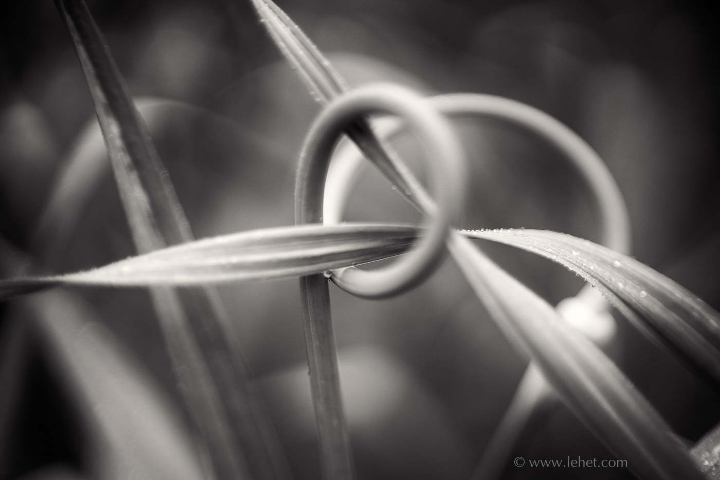
In those view camera days I had two lenses. One was expensive and very good; I think the other one was just as good really, if less fancy. And in those years I looked at the work of other photographers and saw sometimes a sort of glowy quality. Photographers I liked had it: of course Atget. But also some contemporary photographers showed it as well, like maybe some of Olivia Parker’s work. I thought it was something to do with the film, since my experience with lenses was so constrained. Of everything I learned in those old film days, my knowledge of lenses was the biggest hole; and now it is one of my obsessions. It’s only in these modern times that excellent vintage lenses have gotten relatively cheap, and very easy to adapt to a mirrorless digital camera. I can use any old lens on my modern camera (though it is harder to use cross brand modern lenses). I’ve come to know that glowy quality by the name “spherical aberration;” it shows up on some lenses at wide apertures. Usually it’s a negative characteristic. I’ll often think less of photos that show it a lot. I never had it on my old great lenses, or even my modern early digital transitional mediocre lenses. But in the right context, like be beauty of good bokeh blur, it can be a beautiful thing. I love the subtlety of the tones in this week’s image, and this glow works with it to fantastic effect.
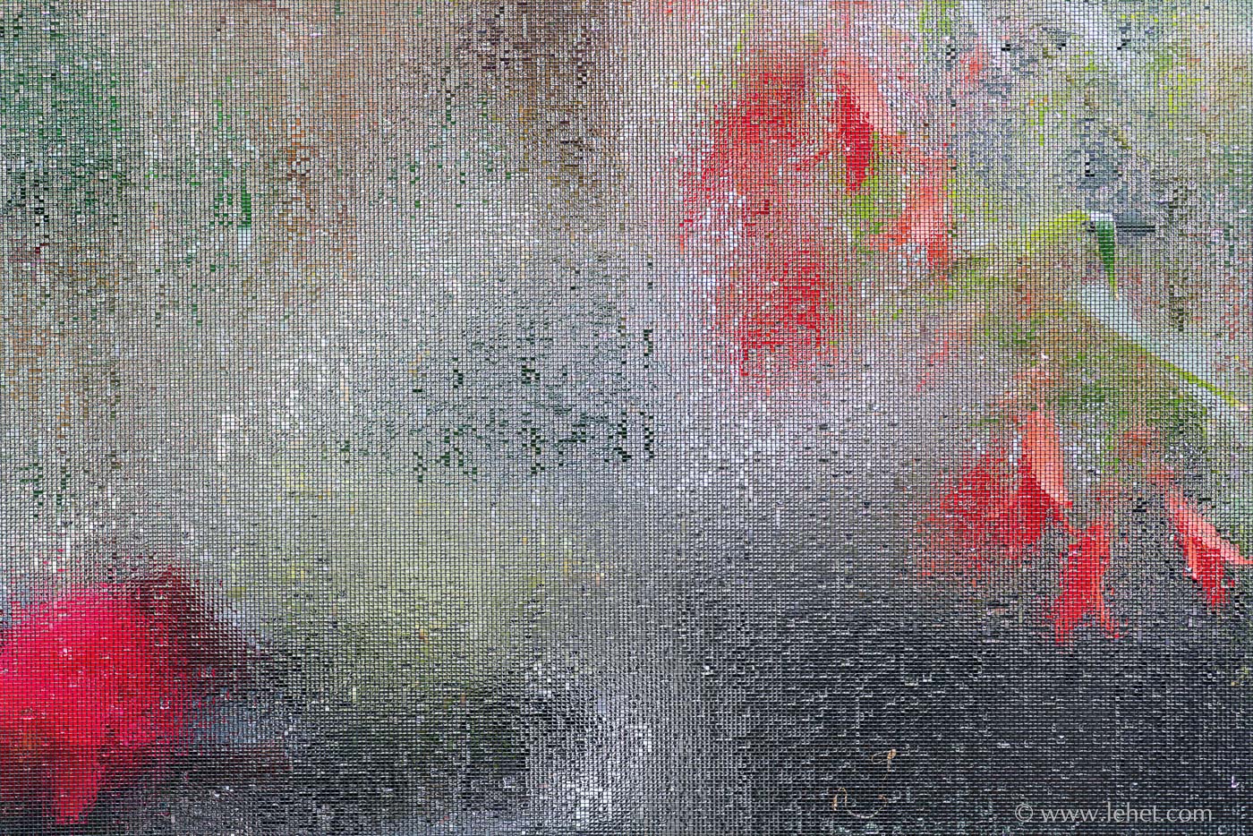
Every year I photograph garlic scapes. My usual endeavor involves working with these plants during the brief window as the scapes are coming up and the roses are blooming nicely. I discovered I can do things like this:
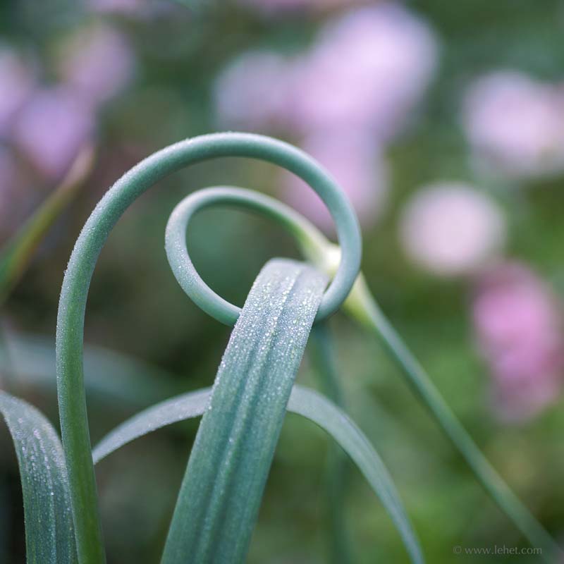
The roses peak a little earlier than the scapes, so it’s brief. The roses get a bit ratty while the scapes are still providing interesting forms and textures. So I photograph them without any roses sometimes. But up to now I had been thinking without the color of the blurred bokeh roses in the background, that these scapes without roses were perhaps less. But no. And maybe the scapes alone were too abstract? Again, no. (I have an awful lot more good exposures of this theme with and without roses than I have published on the site).
Back in those view camera days when I looked at the image as an abstract of form and tone, I mostly carried sheets of black and white film, and so I trained myself hard to only see in black and white, or more accurately, the many tones of gray in between black and white. I’ll save it for other posts how my eye evolved to see color, but the surprising thing is that I no longer see in black and white as my primary vision. Form, tone, texture, movement of the eye through the composition, sure, just like before but better. Those gray tones though I usually see later when working on the computer. This was no exception. But when I saw it: Bam! That’s it.
So I have a lot more of these, million shades of subtle gray toned abstracts of garlic in the garden. This year I am not traveling or even starting the car very often; the COVID-19 Trump pandemic keeps me home.
I’ve been working hard on the inner workings of this website, re-writing most of the 2000 or so lines of CSS that control the layout and behavior of these pages. Now that it’s done, I can add more images to the site, maybe cull some too. Stay tuned, stay safe, check back!

