Category Archives: blue

Boxes Made of Butter

Four Birch Reflections on New Blue Ice

Of course, the shape of the photograph is important. I had stopped seeing panoramas and making them so much, partly because I was having trouble framing them so it would work. Using sturdier frames and better framing technique, and cutting my own glass I’m able to frame them in a sturdy way and without going (as) broke doing it. So I’m seeing them and printing them again. Yay! I’ll be hanging 3 panoramas at an upcoming show at the Eversource headquarters in Manchester NH through the spring, and also some different ones in the gallery in hallway 4F at Dartmouth Hitchcock medical center in Lebanon NH through April and May.

Part of what I like about the pano format is the way the eye can move in a different way. There is something a bit more free, call it “vast” feeling about the space, for me.

Compare to the extreme opposite, a square composition (which I also love, and used a lot in the days when I had added the use of a medium format film camera along with my 4 x 5 view camera main-axe. In this composition, as in many squares, the eye moves back in, it’s tighter, it feels more boxed-in. Which is OK. It’s always a box of some sort.

Dewy Garlic Scape with Roses

I think somehow the sense of composition within a box has a subtle pointer to outside of the box. It points to a bigger scene, and the boxed-in detail evokes a larger space. Since that larger space is here undefined, the space is purely mind. Our mind is bigger than the box.

When I was in college, I remember talking to a friend about people who were “in the boxes” and “out of the boxes.” (Where are you now, Steph?) In the boxes was our way of referring to purely conceptual, standard, and habitual ways of thinking. There was plenty of in the boxes thinking at Dartmouth when I was a student there. Out of the boxes was more emotional, less habitual, open to new experience and ideas. It was rather rarer. The thing is, you need the boxes in this world. We need concepts, defined ideas, a reality that works in its framework. But ultimately the truth has its home out of the boxes as well.

Since those days I’ve become a meditator and a Buddhist; I’ve lived a lot of my life in conceptual terms, I’ve composed photographs that exist in their limited spaces. But I’ve also rested in what Tibetan Buddhists would call “space,” embraced the view of emptiness. My teacher, Tsoknyi Rinpoche literally talked about the framing I’ve done here. To paraphrase (I’m working from memory of a retreat with him), “You need some boxes. That’s why we give you lots of boxes (concepts). But let’s have the boxes be made of butter, so they melt.” (We need to go beyond concept).

These new (and new-ish) photos are available for sale:

Four Birch Reflections in New Blue Ice

Dewy Garlic Scape and Roses

Orange Foliage Reflections Puddles, Riverbank Rock

See me at an Opening Tonight

Apple in New Ice

Tonight at the League of New Hampshire Crafts Headquarters Gallery, in Concord New Hampshire, from 5 to 7:30.

One of three of my photos hanging in the show of new juried members into the League of NH Crafts is the one above, which I’ve never framed up before. It’s a 20 inch wide print in a 22 x 28 maple frame.

(a new photo of the week blog is coming soon!)

New Ice With Brush Stroke Texture, 2017

New Ice with Brush Stroke Texture, Vermont

This photo looks like I somehow enhanced it to create a painting appearance, especially through the middle of the print and on the left, but that is how the ice looked. I just saw it that way through the lens.

For a larger view or to buy a print, go to this photo’s page

Practice helps us remember what we know, when we are in other situations. This goes for practicing photography, and the same for my meditation practice and dharma studies. It’s hard to practice enough, but it helps if I do. The point isn’t just so one can best inhabit the moment when things are going well, but also when things are going badly.

What is the practice? What helps? Well, keeping what we might call The View. Which is to say an understanding of how reality works. It turns out that photography is a lot like meditation in a lot of ways. Probably meditation is the more important practice, but it’s also interesting to have an action that manifests the same wisdom that we mostly learn through non-action. The active version helps spread the view into life. Then there is mindfulness. Attention. Cultivating, making better and better friends with awareness. Again, this cuts both ways. Sometimes with feet in the fire, it just makes it more intense. But then, strangely, sometimes it helps. It helps to feel the fire. It helps, in photography, to be able to wait until the situation is one to work with.

As a photographer, we are open to experience. Shape, form, light, and other events manifest in various ways, and we make an exposure through a lens. Usually that manifestation is temporary. The exact circumstance and light will not occur again. Our job is to experience and recognize the moment and then keep it together to do what we need to get an exposure to work through the lens. Sometimes nothing much is happening that seems worth photographing, and other times it’s hard to keep up with it. Sometimes, from a photographer’s perspective, the world in front of the lens is lousy, and sometimes fantastic.

Al our life is the same. It comes together in a way that will please us from some perspective; then sometimes the way it comes together is not pleasing, useful, or interesting from our personal perspective. Of course the perspective that finds the world pleasing, or not pleasing, is as temporary as other manifestations. If we are hungry, food is beautiful. If we are overstuffed, it can be repulsive. The world changes, perspective changes, but there is always a relationship between our current perspective, arising and changing, and the outer world, manifesting and changing.

Usually the appearance of new ice on my pond is interesting and pleasing to me as a photographer, plenty of chance for interesting texture, color, abstraction. I know it will be gone soon, melting by noon, or else settling into a more solid and boring form as it becomes an enduring sheet.

I used to try for deep depth of field a lot in this kind of photography, but I am loosening up quite a bit, mostly starting last year. This was exposed through a medium long old Zeiss prime lens with amazing sharpness and also a beautiful quality to the blur when out of focus at a medium aperture.

New Book Cover: Silver Road

Blue New Ice and Birch Reflections at Dawn

I’d already posted this as a photo of the week from about a year ago, but I just got some copies of a beautiful book in the mail. It’s a book of “Essays, maps, and calligraphies” by Kazam Ali, called Silver Road, published by Tupelo Press and designed by Ann Aspell. Though my own fine prints of this image have a little more contrast and depth than this book cover as printed, this is printed book is very handsome indeed.

Silver Road Book Cover with photo by John Lehet

It just happens that I included this photo in the show that is currently hanging at Long River Gallery. I thought I’d try printing it pretty big and matting it, and it did not disappoint me. It’s not framed on the wall, but matted in a 22 x 28 rag mat in a bag in the flip-bin.

Available as a fine print here: New Ice and Birch Reflections 2015 II

The book is available directly from Tupelo Press as well as from Amazon and other book vendors.

Printing Subtle Images — Harder Than it Might Seem

Four Morning Glories in Autumn

I’ve been printing a lot just lately. As I mentioned last week, I had a request from my senator’s office to send some prints to hang in their Washington DC office. So I’ve been printing for Bernie Sanders. He wants Vermont images. I’ve printed some of my most popular images, things I’ve printed a lot before. It’s gone well. But then I’ve been trying to push out some new work, as I always feel inclined to do in these circumstances. This printing has been harder than hard. I think sometimes people think a photographer just presses the shutter on the camera, click, and then to print you push a button, click again. Done. So easy. Who would pay for that?

I won’t talk about the camera and lens work, but I find that in some ways printing never gets easier, with some images. Indeed, as my aspirations grow, it just gets harder. I think in some ways the hardest of all are the moody, atmospheric images I’m working on a lot these days, which in some cases only have a relatively small area of sharp subject, and the rest are tones and subtle colors. I think that a more traditional landscape — everything sharp — is a whole lot easier. The detail and the “reality” of the subject distract a lot from other aspects of what is going on with tones and colors. Of course such a print still benefits from the work to get the tones all working. It is just more critical when the photo is more of a tone poem than a detail-subject.

I had been printing in the darkroom since the late 70s, and I got to be quite the craftsman after I took a couple of weeks of workshop given by John Sexton in 1982. He was working as Ansel Adams’ darkroom assistant at that time, and he taught us the craft as Ansel Adams was practicing it. Besides a lot of burning and dodging, paper choice and a lot of tweaking of chemistry were involved, and it took a long time to nail a final print in those days. I printed in the darkroom until about ’98, when I moved away from a darkroom and never had one of my own again.

At first, digital printing was even harder for me than darkroom printing. At first everything was out of control, and I couldn’t get a handle on it. I longed for the darkroom. Eventually I learned the characteristics of a handful of papers, how the ink works, most importantly calibration of monitor and printer profile. Still not easy. Sometimes pretty predictable. Sometimes surprisingly not so. I’ve spent quite a bit of time and expensive materials, but now I have a really nice print of this morning glory in autumn light on Canson Etching Edition paper.

I’ve been working on printing of the image above since mid-December, and I’ve just got prints I’m happy with today, finally. I’ll send one to Bernie.

A print, by being reflective, is a different kind of thing than glowing pixels on a monitor. The image above features some light coming through, the gold burst from the autumn foliage behind the top morning glory. I’ve got to get the paper to convey that sense. The colors are bright and vivid, but it’s tricky to keep it from looking like a cartoon. In some of my attempts it has been hard to keep it from being murky. This is a tricky one.

My first take on working on an image where color and tonal fidelity will usually be to try Canson Baryta paper. This was a complete failure for some reason. It was just too contrasty, and I couldn’t get the feeling to come across, even when reducing contrast in the file I fed the printer. Printing on more textured mat papers, like Canson Edition Etching opened the whole thing up better, less deep and made the light glow, but then there were other problems — color fidelity not as good, and also not a good “anchor” from the deeper tones. I find on some of my textured papers, even with a calibrated workflows, some colors get a little wilder and harder to control.

I had to make a file just for printing, and then tweak the file to get the print to work, a different file from what I display on the screen to look good. The goal I insist on is that the print and the image you see on screen will have the same impression.

Because I’m a masochist, I’m working on another one that is just as hard. I’m still not quite happy with the print of this one, but I’m working on it this afternoon. My target is to get it to work on Canson Rag Photographique, a smooth paper that is still distinctly papery, and which still conveys the open quality I’m looking for. Closing in on it I think.

New Beech Leaves, 2017

Dewdrops and Blue Flag Iris, or, Figure with Ground

Dewdrop and Four Blue Flag Iris

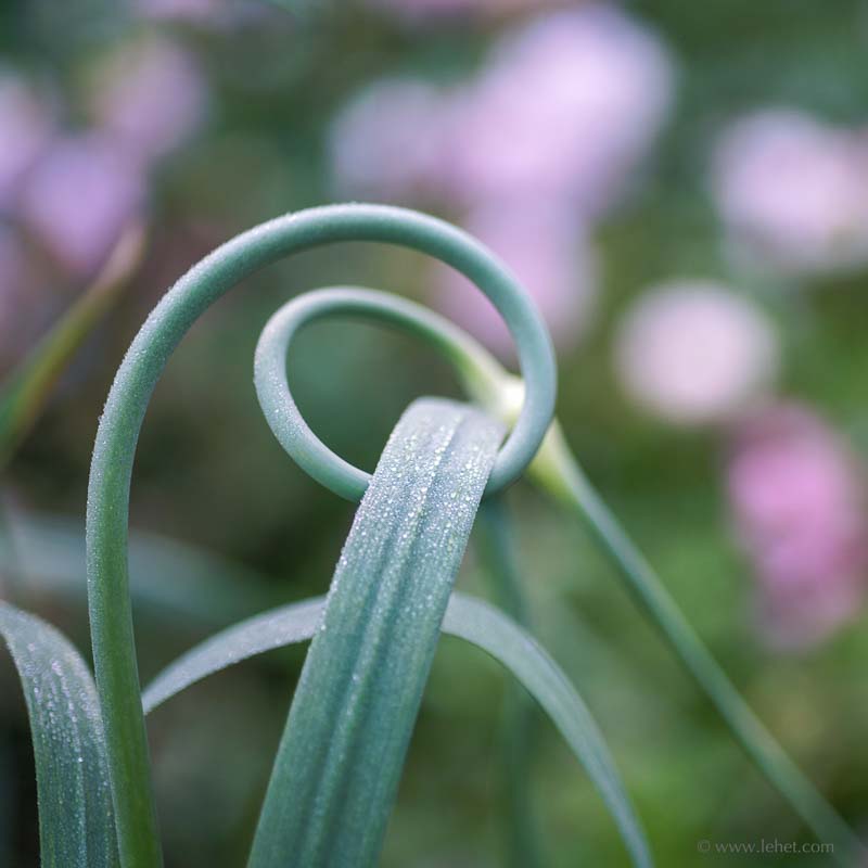
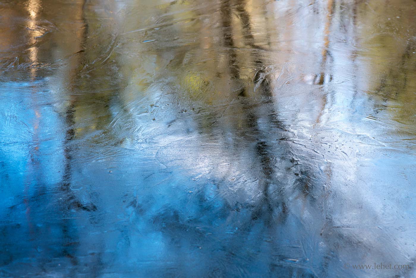
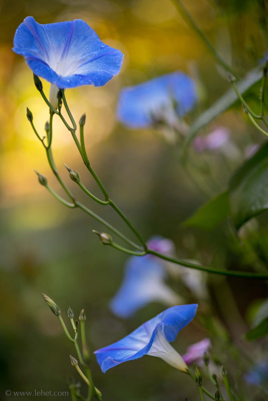
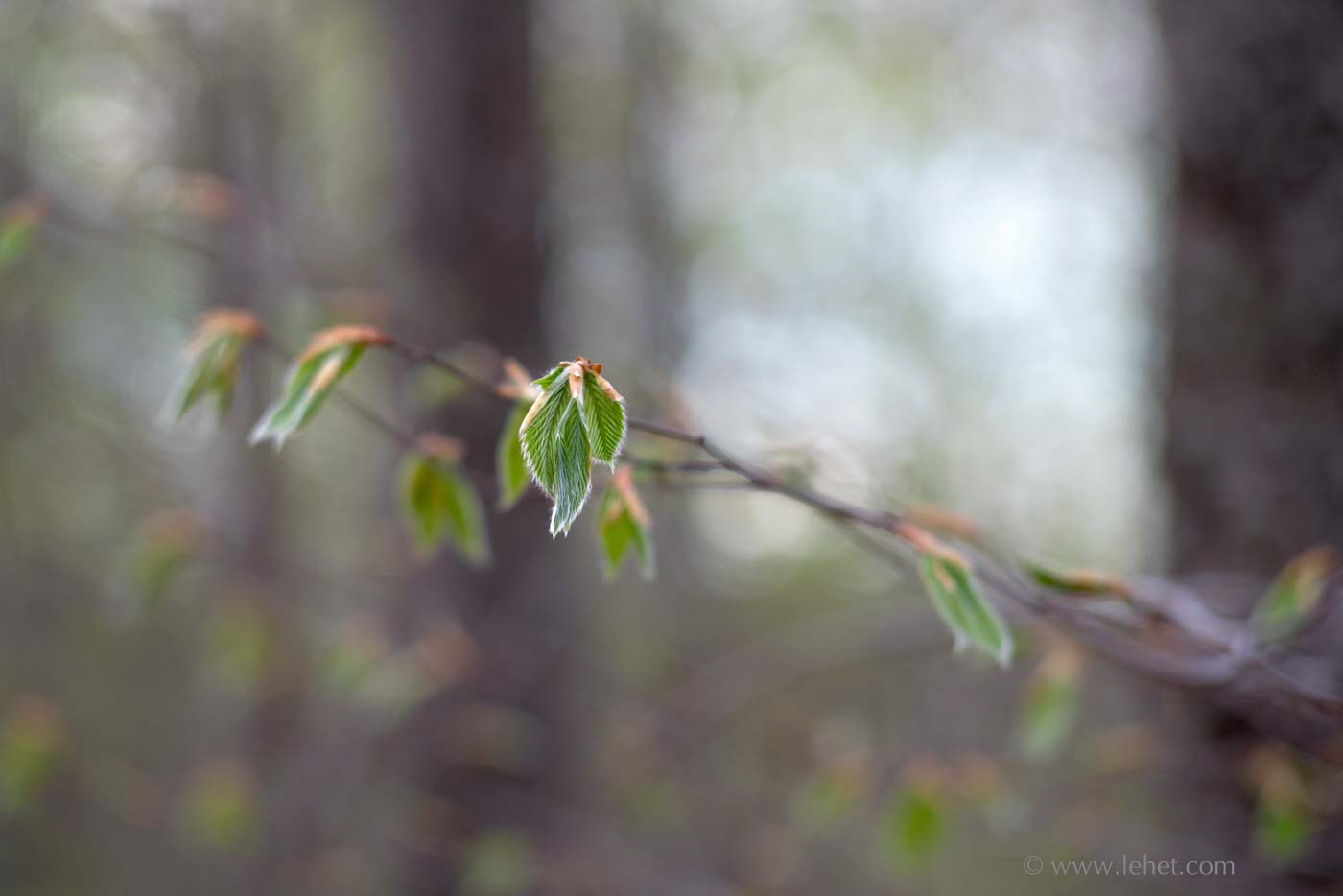
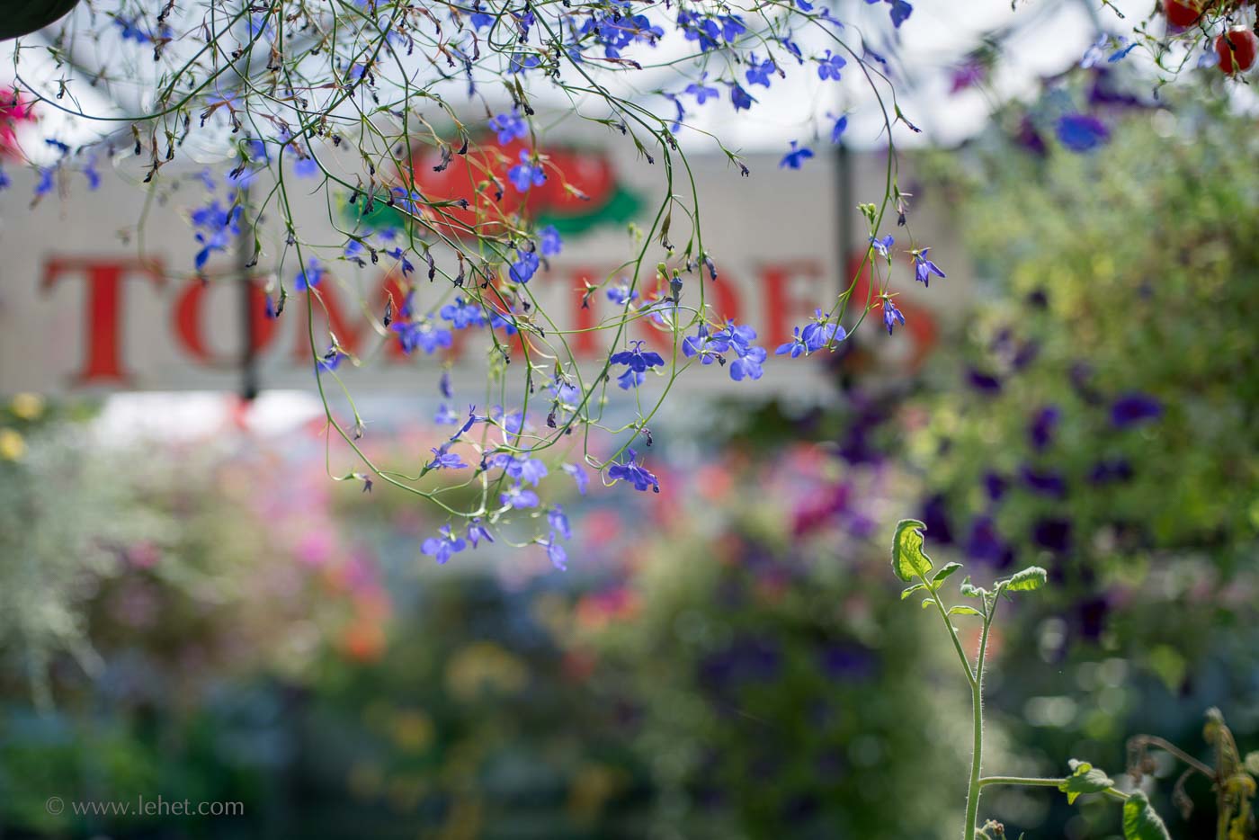
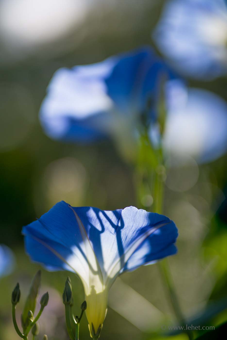
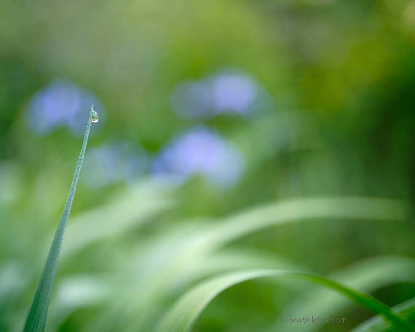
These are two images made with some old Japanese (Olympus, OM) lenses that are known for the quality of their out of focus rendering. They are not “photoshopped” or manipulated. This is the way the lenses (a different lens for each image) and camera made them.

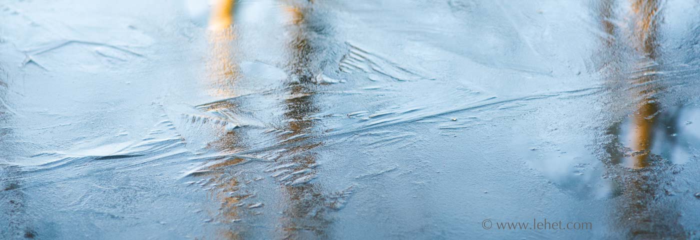
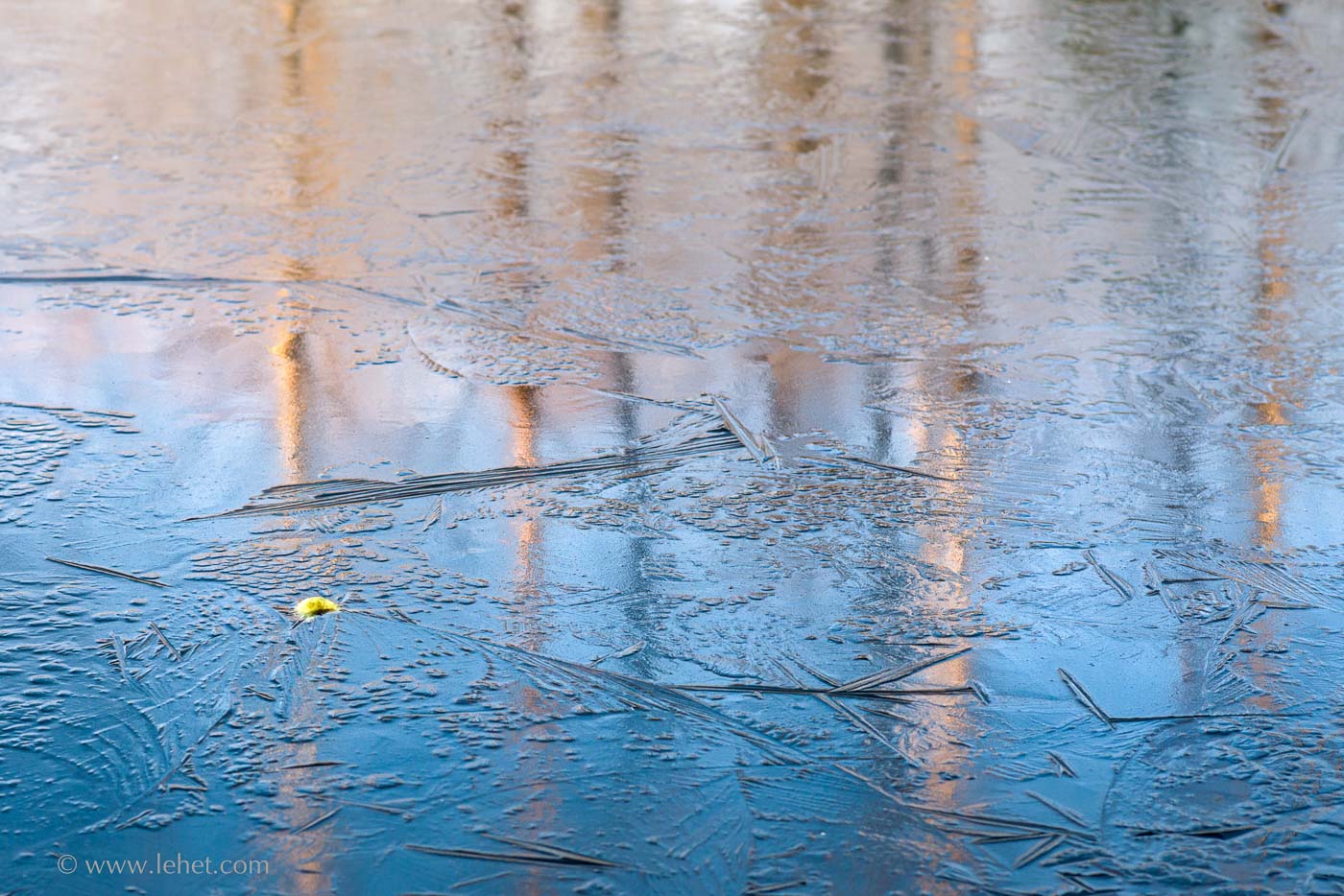
“Bokeh” is a term coined in Japan to talk about the out of focus or “blurry” area of an image. The reason the word is handy is that we can talk about the characteristics of that out-of-focus quality, and acknowledge that there are various aspects to it, and put what is normally background into something like the foreground, either when we talk about it or when we work on making an image through a lens. There is a lot of talk about “bokeh” on lens geek forums, but usually about the characteristics of particular lenses, how they manifest this quality at different apertures. But at least in the English language, in my reading, I’ve never come across much on the philosophical or even spiritual aspects of this aspect photographs created with certain wide aperture lenses in certain ways

Two Dew Drops, One Blue Flag Iris

.

It’s interesting that the word “bokeh” came from Japan, a traditionally Buddhist country. While modern Japan is very westernized in many ways, there is a strong aesthetic tradition that permeates much of the culture, rooted in Zen. While many Japanese people are not practicing meditators, the philosophy based on meditation and Buddhist teachings still has a strong sway even in these modern times of technology and materialism — technology that can create consumer lenses with certain characteristics. Oddly enough, I wrote a paper on the influence of Zen on Japanese culture and aesthetics in high school, in about 1974. I had forgotten about that paper and studying this topic, until sitting at the keyboard right now. Back then I didn’t have a strong understanding of Buddhism — though I studied it for that paper — and really what it means at a deep level that can permeate everything. I was just interested in it and drawn to the aesthetic, even then as a mid-teenager. Weird.

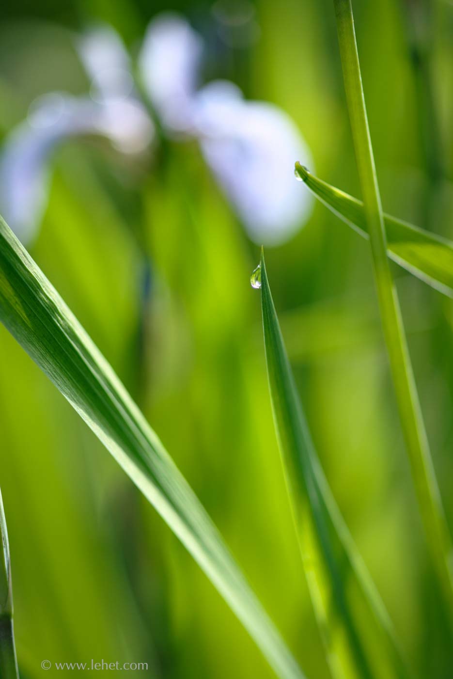
The aesthetic I’m talking about, of course, is art that places the importance of negative space as an equal, or even more important component of the composition, as the “subject” of the artwork. One famous example of this is the Enso calligraphy of Zen though of course it shows up in countless examples of oriental art. I think it’s less obvious in the Ukiyo-e prints, but the use of negative space is often very important there as well.

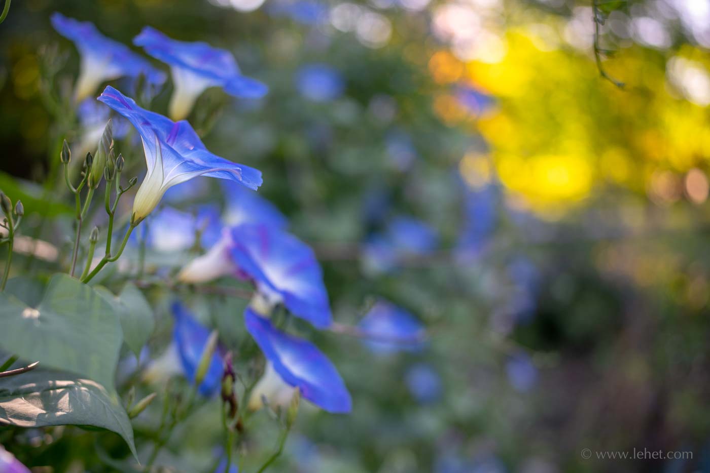
I think it’s also interesting that some Japanese lenses seem to have good bokeh or amazingly excellent bokeh, as part of their design, while fewer German lenses (I’m looking at you, Zeiss) might in general be better at sharpness and contrast and in general not quite drawing the out of focus areas quite as beautifully. Though there are of course exceptions; for example this image was made with a vintage Zeiss lens that surprised me in rendering such beautiful out of focus areas. I don’t know Leica lenses, but I guess they are an exception to my cultural rule.

In high school when I studied and observed the influence of Zen on culture, I really had no idea, just a hunch. And for years and years I had no idea at a deep level. After many long meditation retreats and thousand of hours sitting in meditation, I have had some understanding of what is going on here. (I am still far short of the 10,000 hours of meditation practice that some neuroscientists, I think Richard Davidson is one, say is the threshold where the brain really changes pretty drastically, and even shows unique qualities in FMRI machines. The two “happiest men in the world,” Matthieu Ricard and Mingyur Rinpoche, have been studied extensively along with some monks associated the Dalai Lama, showing that over 10,000 hours is a real change point).

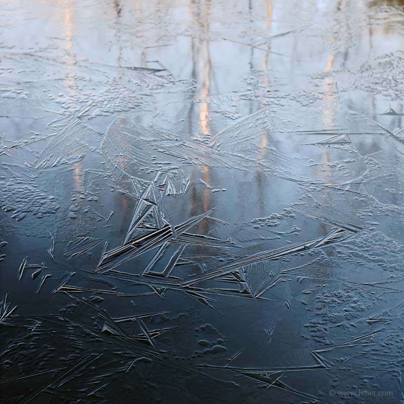
I had an experience in one long meditation retreat a decade ago, which lasted for the rest of that retreat, and then has become more reliable over the decade since then, with more retreats and more practice. That experience was in seeing “emptiness,” or Shunyata as it was called in early Buddhist languages. My Tibetan Buddhist meditation teacher, a real meditation master also is prone to talk about “space” as well. He once joked, “I’m not talking about made-in-India space. I’m talking about made-in-space space!” So what I experience quite a bit of the time is a shifting allegiance, shifting between what is there, and what is not as apparently sold, between a thing, a thought, an experience — and the space around it. In the case of a mental or emotional experience, which of course is our whole life, the “space around it” is a cognizance bigger than a mere thought or emotion. In that first breakthrough retreat, I conceptualized it as being like one of those figure-ground shifting images, like this one. It is two faces. It is a vase. It all depends on whether you have perceptual allegiance to the foreground or the background, the white or the black.

Figure Ground Paradox Vase Two Faces

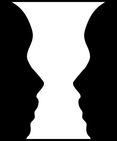
(I should be clear that in Buddhist teachings what I’m talking about here as “space” is not merely the negative aspect of matter or thought or whatever. It is all-encompassing, and includes all. So my two-vases/face example is to me more about a shift of allegiance rather than a literal positive/negative. “Space” in this context means an allegiance to everything, the solid, and the not solid, matter and space; all of it.)

This is most important when working with the mind, and I think meditation is the best way to develop this capacity. In the west, therapy can often also facilitate the cultivation of this kind of shift, because the therapist is hopefully helping provide a bigger view beyond what we normally think of as the “solid” aspects of our cognition, perception, and emotional experience. Experiencing nature, or perhaps religion, can also be some sort of access to a sense of space, but most of our experience in the west falls short of a Buddhist understanding of space or emptiness. This capacity is extremely important when working with emotions. When the emotional experience is all there is, then we often suffer from it, or cause others to suffer. The point is that the thought or emotion is just an isolated event, with little actual substance, like a drop of dew — an isolated not-even-really-a-thing that is surrounded by space. Like the dewdrop, it has very little actual substance, and certainly no permanence. While I think art that manifests this quality is often profound in itself, it may be more significant that it is pointing to something bigger, a truth, an experience that is more important and profound than art.

I think since I’ve been meditating more seriously, over the last 15 years, my photography has changed quite a bit, but gradually. And I think it’s only more recently that I have a lot more comfort shifting between the figure and the ground, between what is there and what is not there in a conventional sense. Though in another sense, the ground represents something that is more real than what we normally take as real. That is an exploration I will leave for the reader.

Lobelia, “Tomatoes” Sign, Greenhouse

Tomatoes Sign, Lobelia, Greenhouse

I’ve been posting these color flowers and shallow depth of field images, but they’re not the only thing I’ve been doing. It’s just that they’re the ones that get stuck in my head, and I get excited to print them. I had a summer a few years ago when I was looking at Ukiyo-e (“floating world,” the genre of Japanese prints that includes Hokusai and others). Those images filled my mind and influenced my compositions. In this period I seem to be finding some of my inspiration from my quirky old vintages lenses themselves, the way they draw with light, and maybe especially the way colors mingle and mix beyond the plane of focus.

Last week I talked about re-doing images, and this was in fact a re-do. As regular readers know, I’m not just photographing casually. I tend to work on ideas and places iteratively. I work crazy hard on my photography. Often I get to know a situation better by working on it, while other times I find it hard to make up for the serendipity of new discoveries. The mix of hard work and grace is somewhat mysterious, here, as in meditation, as in all of life.

But I do learn as I go, learn how situations resonate as a photograph, how they will print, how each of my quirky old lenses work at different apertures and in different light. I learn both how to work with situations, to have patience when it’s not working, and to accept the grace of what is simply given.

When I first tried to make this image I was using an ancient film lens on an adapter, and the adapter was (the only time I’ve seen this) interfering with the lens’ ability to change aperture. It was stuck wide open, at f1.4. That would have been great, if that particular lens were any good wide open like that. It wasn’t.

I had a bit of time between meetings, so I went back to this greenhouse. The light was nicer than the first time I was there, by a lot.

I happened to have a different ancient film-era lens, that does have some good qualities wide open, at f2 (though this exposure was stopped down one stop, to f2.8; I prefer the little bit more detail in the background to the f2 exposure). All these old lenses have their own quirks, and this one is sort of the opposite to that other lens, which gives an extremely impressionistic rendering at wide apertures. This one is dreamy, while still sharp, mixing colors together in a nice, soft way while keeping the structure of the image somewhat together.

So this is a case where the re-do worked out better than the first attempt.

Morning Glories Dawn, Edge of Fall, Impermanence

Morning Glories Early Autumn Vermont

Late this summer I got obsessed with morning glories. Part of it had something to do with a new lens, a vintage macro lens that provided very smooth out of focus areas, bokeh, which worked beautifully with the blue and other colors. Also, the daily display was an ever changing kaleidoscope. Anicca, impermanence, is always somehow an engine in my photography, as I’ve explained in other posts. I had it in spades here. Each morning glory flower lasts for just a day in cool weather. It turns out that a single blossom will last into the next day if it is quite cool, and then the flowers are more purple on the second day. On the other hand if it is quite dry and warm, these soap-bubbles of blue don’t even make it through the day. And then of course the dew, and the changing light transforms everything, whether the light is coming through them or shining on them, it’s completely different.

This image though wasn’t with that vintage new-to-me lens though, but rather one of my other vintage manual prime lenses, this one wider. I did not do some of the things I normally would have, and there are some regrets about what might have been in this exposure, but really it has turned out.

So here we have it in a nutshell. Everything changes. Sometimes we have regrets. It is what it is. These blue saucers were gone by that evening, and now the vines are brown mush. But impermanence works both ways. Gone each day, but only appearing in the first place because of change. Reappearing and transforming each day because of change. The extraordinary beauty only possible and indeed more poignant because of the transience.

We fear impermanence sometimes; we want to hang onto the good and beautiful and pleasurable, and we resist the coming of the nasty. The impermanence itself though is not to be feared. It facilitates the demise of the nastiness just as surely as it enables the blossoming of the beautiful and good. Ah annica. Simply the way things are.

This photo is available as a print, printed like last week’s image on Canson Aquarelle Watercolor paper. Buy the print here.

Ordinary Miracles – Four Morning Glories

Four Morning Glories

In my practice of photography there is a tension. The natural tendency is to look for the unusual, striking, breathtaking, exotic. But my saving grace is an ability to be present with what simply is, and fully embrace that, at least sometimes.

In looking for the exotic, there comes a striving, a discontent with so much of what we encounter — even when we are actually in the midst of something spectacular. We become what Buddhists call “hungry ghosts” — a mental realm where nothing is ever enough. Photography in this context becomes a perpetual bar-raising for more unusual subjects and locations.

On the other hand, by being with whatever is, there is often more interest and beauty available to us all, right where we are — vast rich experience is available in all of our everyday life if we dare to approach it undefended and full of curiosity.

I was struck in a conversation at my dad’s bedside, a hospital visit recently. My sister, a bodhisattva, was talking about a situation where she was helping someone. The nurse’s aid in the room described that person as having found a miracle. And it is true, that causes and conditions have come together in a very lucky way for that person; you could call it miraculous. But what struck me is that by thinking of miracles as distinct from the everyday miracle of every aspect of our existence, we diminish everything. It’s not that this life is a low and dull thing, and somewhere, out there, are rare things called miracles. The whole thing is a miracle. The whole damn manifestation of this existence. Nothing less than miraculous.

In Buddhist meditation practice, we are constantly cautioned to not seek high or extraordinary experiences. Inhabiting the ordinary fully is the practice. I think, despite awareness of this dichotomy in my photographic life, that I wasn’t really fully understanding why we meditate in this way. It’s not just that we “settle” for the ordinary. Fully inhabiting the ordinary, we see its richness, depth, and mystery. To look for the extraordinary, we miss the entire miracle, the whole miracle of our existence on earth. You miss that, you miss most everything. Looking for something somewhere else, something fancy, we miss everything.

So here in my own garden in morning light with a vintage manual camera lens and the blessing of time to really look, it is enough. More than enough.

This is a high resolution file, and it makes a spectacular print at any size. I print it on Canson Arches Aquarelle Watercolor paper. Prints available here.