Category Archives: Gold

Boxes Made of Butter

Four Birch Reflections on New Blue Ice

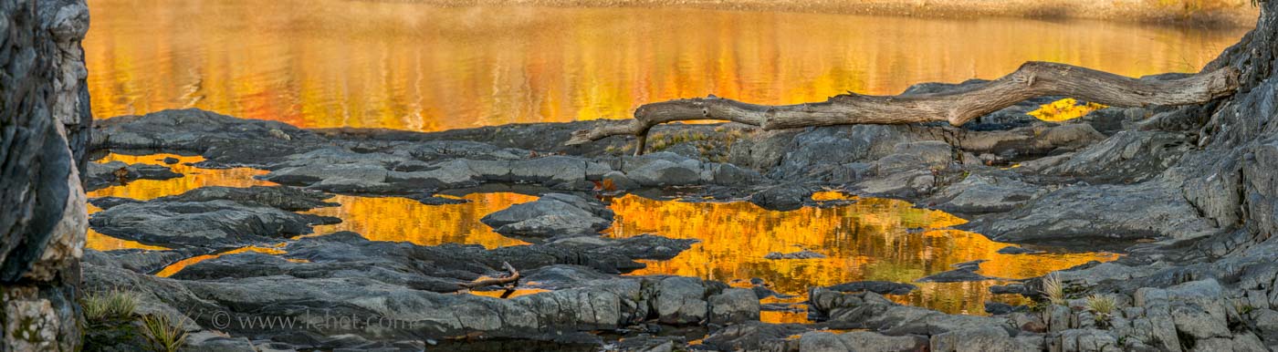
Of course, the shape of the photograph is important. I had stopped seeing panoramas and making them so much, partly because I was having trouble framing them so it would work. Using sturdier frames and better framing technique, and cutting my own glass I’m able to frame them in a sturdy way and without going (as) broke doing it. So I’m seeing them and printing them again. Yay! I’ll be hanging 3 panoramas at an upcoming show at the Eversource headquarters in Manchester NH through the spring, and also some different ones in the gallery in hallway 4F at Dartmouth Hitchcock medical center in Lebanon NH through April and May.

Part of what I like about the pano format is the way the eye can move in a different way. There is something a bit more free, call it “vast” feeling about the space, for me.

Compare to the extreme opposite, a square composition (which I also love, and used a lot in the days when I had added the use of a medium format film camera along with my 4 x 5 view camera main-axe. In this composition, as in many squares, the eye moves back in, it’s tighter, it feels more boxed-in. Which is OK. It’s always a box of some sort.

Dewy Garlic Scape with Roses

I think somehow the sense of composition within a box has a subtle pointer to outside of the box. It points to a bigger scene, and the boxed-in detail evokes a larger space. Since that larger space is here undefined, the space is purely mind. Our mind is bigger than the box.

When I was in college, I remember talking to a friend about people who were “in the boxes” and “out of the boxes.” (Where are you now, Steph?) In the boxes was our way of referring to purely conceptual, standard, and habitual ways of thinking. There was plenty of in the boxes thinking at Dartmouth when I was a student there. Out of the boxes was more emotional, less habitual, open to new experience and ideas. It was rather rarer. The thing is, you need the boxes in this world. We need concepts, defined ideas, a reality that works in its framework. But ultimately the truth has its home out of the boxes as well.

Since those days I’ve become a meditator and a Buddhist; I’ve lived a lot of my life in conceptual terms, I’ve composed photographs that exist in their limited spaces. But I’ve also rested in what Tibetan Buddhists would call “space,” embraced the view of emptiness. My teacher, Tsoknyi Rinpoche literally talked about the framing I’ve done here. To paraphrase (I’m working from memory of a retreat with him), “You need some boxes. That’s why we give you lots of boxes (concepts). But let’s have the boxes be made of butter, so they melt.” (We need to go beyond concept).

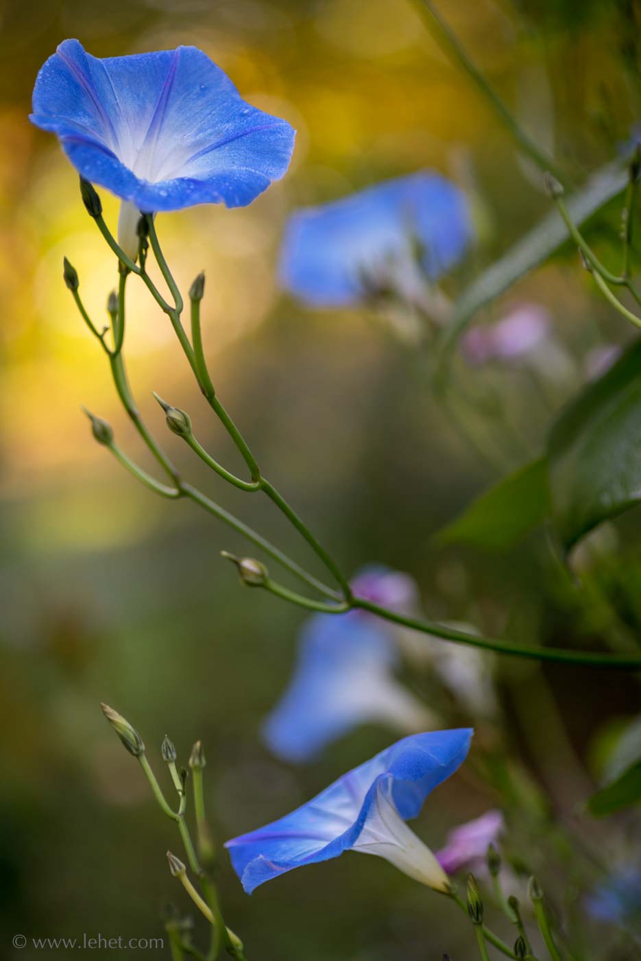
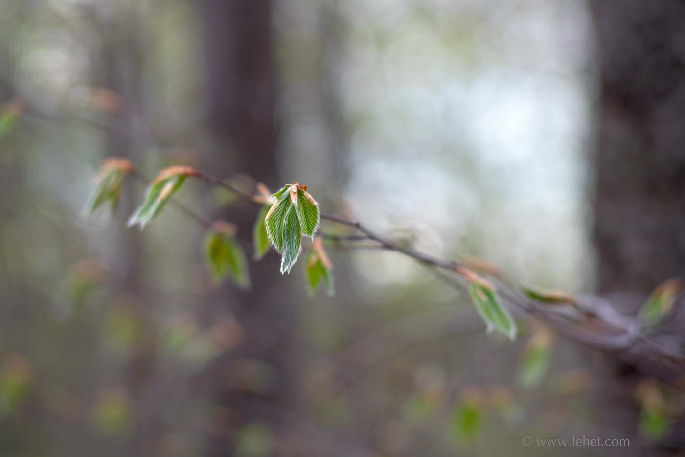
These new (and new-ish) photos are available for sale:

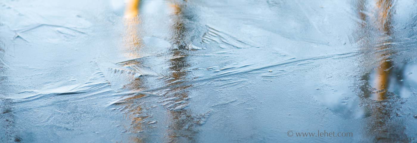
Four Birch Reflections in New Blue Ice

Dewy Garlic Scape and Roses

Orange Foliage Reflections Puddles, Riverbank Rock

Printing Subtle Images — Harder Than it Might Seem

Four Morning Glories in Autumn

I’ve been printing a lot just lately. As I mentioned last week, I had a request from my senator’s office to send some prints to hang in their Washington DC office. So I’ve been printing for Bernie Sanders. He wants Vermont images. I’ve printed some of my most popular images, things I’ve printed a lot before. It’s gone well. But then I’ve been trying to push out some new work, as I always feel inclined to do in these circumstances. This printing has been harder than hard. I think sometimes people think a photographer just presses the shutter on the camera, click, and then to print you push a button, click again. Done. So easy. Who would pay for that?

I won’t talk about the camera and lens work, but I find that in some ways printing never gets easier, with some images. Indeed, as my aspirations grow, it just gets harder. I think in some ways the hardest of all are the moody, atmospheric images I’m working on a lot these days, which in some cases only have a relatively small area of sharp subject, and the rest are tones and subtle colors. I think that a more traditional landscape — everything sharp — is a whole lot easier. The detail and the “reality” of the subject distract a lot from other aspects of what is going on with tones and colors. Of course such a print still benefits from the work to get the tones all working. It is just more critical when the photo is more of a tone poem than a detail-subject.

I had been printing in the darkroom since the late 70s, and I got to be quite the craftsman after I took a couple of weeks of workshop given by John Sexton in 1982. He was working as Ansel Adams’ darkroom assistant at that time, and he taught us the craft as Ansel Adams was practicing it. Besides a lot of burning and dodging, paper choice and a lot of tweaking of chemistry were involved, and it took a long time to nail a final print in those days. I printed in the darkroom until about ’98, when I moved away from a darkroom and never had one of my own again.

At first, digital printing was even harder for me than darkroom printing. At first everything was out of control, and I couldn’t get a handle on it. I longed for the darkroom. Eventually I learned the characteristics of a handful of papers, how the ink works, most importantly calibration of monitor and printer profile. Still not easy. Sometimes pretty predictable. Sometimes surprisingly not so. I’ve spent quite a bit of time and expensive materials, but now I have a really nice print of this morning glory in autumn light on Canson Etching Edition paper.

I’ve been working on printing of the image above since mid-December, and I’ve just got prints I’m happy with today, finally. I’ll send one to Bernie.

A print, by being reflective, is a different kind of thing than glowing pixels on a monitor. The image above features some light coming through, the gold burst from the autumn foliage behind the top morning glory. I’ve got to get the paper to convey that sense. The colors are bright and vivid, but it’s tricky to keep it from looking like a cartoon. In some of my attempts it has been hard to keep it from being murky. This is a tricky one.

My first take on working on an image where color and tonal fidelity will usually be to try Canson Baryta paper. This was a complete failure for some reason. It was just too contrasty, and I couldn’t get the feeling to come across, even when reducing contrast in the file I fed the printer. Printing on more textured mat papers, like Canson Edition Etching opened the whole thing up better, less deep and made the light glow, but then there were other problems — color fidelity not as good, and also not a good “anchor” from the deeper tones. I find on some of my textured papers, even with a calibrated workflows, some colors get a little wilder and harder to control.

I had to make a file just for printing, and then tweak the file to get the print to work, a different file from what I display on the screen to look good. The goal I insist on is that the print and the image you see on screen will have the same impression.

Because I’m a masochist, I’m working on another one that is just as hard. I’m still not quite happy with the print of this one, but I’m working on it this afternoon. My target is to get it to work on Canson Rag Photographique, a smooth paper that is still distinctly papery, and which still conveys the open quality I’m looking for. Closing in on it I think.

New Beech Leaves, 2017

Round Table, Chicago Sunset Reflection

Chicago cityscape

Since I was in Chicago last summer, I’ve traveled quite a lot, and also I’ve spent a lot of time with a camera around my haunts in Vermont. I’ve been to Norway and back to Iceland since then. But most of those photos are still hidden from the world. This one popped up on my screen, again, and I just had to print it. It’s on Canson Baryta, which works better for this image than the textured matte papers I’ve tried, because this paper has better separation of the dark tones in the shadows.

When I was a skinny young guy lugging around a view camera, I benefitted from the experience in at least a few ways. One of them was that while composing and focusing I saw the image upside down and backwards on the large ground glass of the camera. This meant that I could abstract a sense of geometry, form and tone more instinctively. I often would not make the exposure if the composition didn’t work when it was upside down; having set up the view camera for nothing was negative reinforcement, so I learned.

I’m not sure if this image works well upside down, but I think it works on account of the geometry and tones. And those qualities work together with the mood of it. I was there, and in a mood, so to me that seems to be in the photo. Hopefully you catch a feeling from it too, though we never know if we really share the same mood or feeling. It’s a mystery. All of human connection, and especially that which can happen through a bit of art, is mystery.

This print is available for sale on Canson Baryta paper in various sizes.