Category Archives: Spring

Direct Experience, Not Conceptual

Flowering Trees, Tulips, and White Hat
Flowering Trees, Tulips, and White Hat, 2019

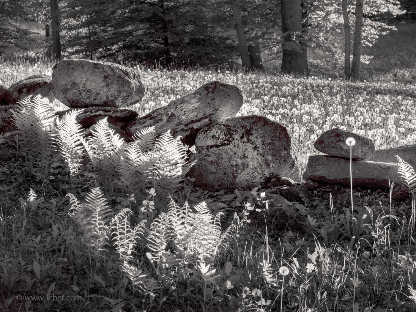
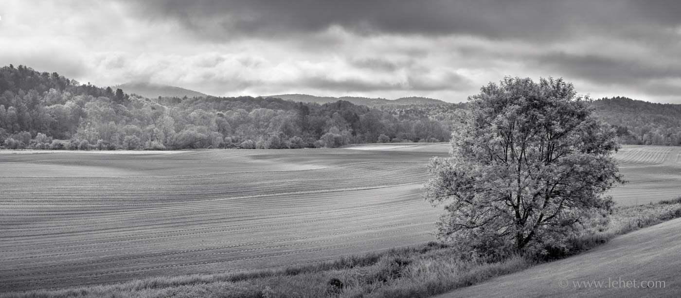
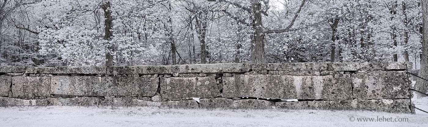
I’ve just made some spectacular prints of this new photo on Canson Aquarelle Watercolor paper. The 15 x 20 print is especially drop-dead gorgeous, but they all are good. Purchase here.

One commonality between my practice of photography and practice/experience of Buddhist meditation is a practice and aspiration to experience directly and non-conceptually. This applies to perceptions, emotional experience, logical process, physical sensation. It’s a trick that will take a lifetime. I won’t go into the Buddhist philosophy and practice behind this, assuming you are on the site for photography. And there are better Buddhist teachers than me.

So in photography, a conceptual approach might be fine. Many photographers have succeeded with a conceptual basis for their approach. In my opinion, quite often these often fail. There are photos in major modern photography galleries of, say, a tree with cheese doodles stuck around the trunk with toothpicks. Then in the blurb it will say the artist is exploring the post-industrial relationship to nature, or something like that. It doesn’t work for me, but then they are in those galleries and I am not, and probably won’t be.

I find though that as I work in any situation different levels of conceptual approach, in one way or another, will creep in. I think ideally working with a camera might be like a master jazz musician improvising on an instrument, that kind of transparency, being able to instantly hit the notes without thinking about it. The musician might think, “what if I went into that dark key right here?” — and that is a kind of conceptualizing that works in the service of the playing. I will think, “What if I tried that old Olympus 90 at a wide aperture?” — and I know what kind of a “key” I will be playing in then. You’ve got to think, think on your feet. Just don’t over-think and make it a formula or purely a concept.

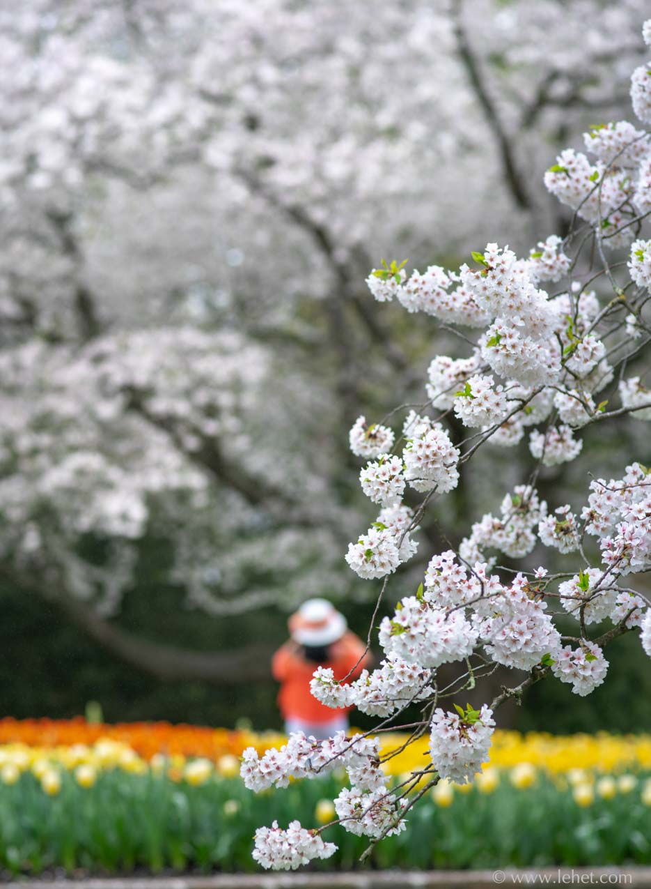
So in the case of the photo above, I had gotten to some extent into the conceptual weeds. I was working with this composition: the branch of the flowering tree in the foreground with a shallow depth of field, the tulips and large background flowering tree beyond the focal plane. Trouble is that people kept coming into the composition, sometimes looking good with umbrellas, sometimes with that clunky tourist vibe. I was usually waiting for them to pass out of whatever frame I had. I had come to be pretty boxed in by the concept of what I thought I wanted to be working with. But then this woman popped into my viewfinder — the orange shirt echoing the tulips, looking up, the round hat perfect. I wish I had been able to work more quickly and fluidly with her there. I did what I did, and I was glad to have made this and a few other exposures of that situation.

Clarity

Stone Wall, Ferns, Dandelions,Vermont

First, let me get out of the way that I don’t mean to write about “clarity” as a slider in Photoshop, Lightroom, or other post-processing software. I will digress and write about that a little bit to get it out of the way. Also, to clarify: I did not use this slider or effect on this image. If I ever do use it, it is very sparing.

That post-processing form of “clarity” is a subtle to not-subtle distortion of tonal values. The effect changes the tone not just at the edge, as “sharpening” algorithms do. It changes a whole block of tonality, which may have the effect of changing our perception of the detail of an image. While it is sometimes helpful, I tend to not like it or its over-use very much. The resultant images often look “crunchy” and over-wrought. Here is an interesting example of it, which I often show to students if I’m teaching Lightroom or Photoshop. First, a set of pure tones, unprocessed. We may perceive edge effects just because of the way we are wired, but the tones are solid:

Straight up

Next, here is the same set of tones with “clarity” applied in Adobe Lightroom:c

Clarity applied

You can see above that the sense of edges between the tones is enhanced, but the purity and actual clarity of the tones is distorted in favor of a sort of 3-d effect here. The clarity slider – be careful!

The clarity I think about is our perceptual clarity, how we see, a quality of one’s mind.

In the path of becoming a decent photographer, there are stages in developing clarity of vision.

First off, it’s a challenge to see what the world looks like instead of what one imagines it to be. This is the primary challenge: seeing through our own preconceptions. There is so much to see in any scene in front of our eyes, and instead of doing our best to really look at it, as a baseline, we are content to seeing a bit and then creating our own fantasy image of what we see. We might not really see the shape of a tree, but instead we are satisfied that it has a trunk and then some leaves, as a child will often draw a tree as a brown stick with a green circle on top. Light, shadow, shapes, texture; it’s a lot of work to see what’s really there, and we don’t make the effort unchallenged.

The second stage of gaining some clarity as a photographer is actually seeing what is in the viewfinder, and imagining what that looks like as a flat thing – a photograph. The common example is making a portrait whenthe subject has a tree or pole in the background. In a print it will look like the pole is growing out of the subjects head — or at least it is a distracting break from the shape of a person and a head, to have the sharp vertical in the same place.

After we can not only see the world clearly and visualize it as a photograph, with no extraneous or distracting or unexpected elements, we can start to think about how the viewer’s eye will move through it, as through a painting. Curves, shapes, depth, texture, in and out. A work of art works better when it creates a dance for the eye, moving around the frame.

And as these other aspects are developing, we can develop clarity in the realm of human resonance. How does it feel? Is that feeling profound? Might it be shared among viewers? Can something beyond words be communicated, a sense of presence, of… something?

And behind it all… the mind. In a way we can develop or “improve” aspects of clarity, but in another sense we are just getting in touch with something that is already there. In a way there is nothing to improve. My Buddhist teacher says that clarity of mind, like awareness and some other intrinsic qualities, just is. It’s there — all we have to do is access it. How do we do that? It’s a practice, and all of the above helps, but meditation may be the most helpful practice. Also helpful to have a teacher who can point out this aspect of mind, any people you can hang out with who have access to their clarity.


Printing Subtle Images — Harder Than it Might Seem

Four Morning Glories in Autumn

I’ve been printing a lot just lately. As I mentioned last week, I had a request from my senator’s office to send some prints to hang in their Washington DC office. So I’ve been printing for Bernie Sanders. He wants Vermont images. I’ve printed some of my most popular images, things I’ve printed a lot before. It’s gone well. But then I’ve been trying to push out some new work, as I always feel inclined to do in these circumstances. This printing has been harder than hard. I think sometimes people think a photographer just presses the shutter on the camera, click, and then to print you push a button, click again. Done. So easy. Who would pay for that?

I won’t talk about the camera and lens work, but I find that in some ways printing never gets easier, with some images. Indeed, as my aspirations grow, it just gets harder. I think in some ways the hardest of all are the moody, atmospheric images I’m working on a lot these days, which in some cases only have a relatively small area of sharp subject, and the rest are tones and subtle colors. I think that a more traditional landscape — everything sharp — is a whole lot easier. The detail and the “reality” of the subject distract a lot from other aspects of what is going on with tones and colors. Of course such a print still benefits from the work to get the tones all working. It is just more critical when the photo is more of a tone poem than a detail-subject.

I had been printing in the darkroom since the late 70s, and I got to be quite the craftsman after I took a couple of weeks of workshop given by John Sexton in 1982. He was working as Ansel Adams’ darkroom assistant at that time, and he taught us the craft as Ansel Adams was practicing it. Besides a lot of burning and dodging, paper choice and a lot of tweaking of chemistry were involved, and it took a long time to nail a final print in those days. I printed in the darkroom until about ’98, when I moved away from a darkroom and never had one of my own again.

At first, digital printing was even harder for me than darkroom printing. At first everything was out of control, and I couldn’t get a handle on it. I longed for the darkroom. Eventually I learned the characteristics of a handful of papers, how the ink works, most importantly calibration of monitor and printer profile. Still not easy. Sometimes pretty predictable. Sometimes surprisingly not so. I’ve spent quite a bit of time and expensive materials, but now I have a really nice print of this morning glory in autumn light on Canson Etching Edition paper.

I’ve been working on printing of the image above since mid-December, and I’ve just got prints I’m happy with today, finally. I’ll send one to Bernie.

A print, by being reflective, is a different kind of thing than glowing pixels on a monitor. The image above features some light coming through, the gold burst from the autumn foliage behind the top morning glory. I’ve got to get the paper to convey that sense. The colors are bright and vivid, but it’s tricky to keep it from looking like a cartoon. In some of my attempts it has been hard to keep it from being murky. This is a tricky one.

My first take on working on an image where color and tonal fidelity will usually be to try Canson Baryta paper. This was a complete failure for some reason. It was just too contrasty, and I couldn’t get the feeling to come across, even when reducing contrast in the file I fed the printer. Printing on more textured mat papers, like Canson Edition Etching opened the whole thing up better, less deep and made the light glow, but then there were other problems — color fidelity not as good, and also not a good “anchor” from the deeper tones. I find on some of my textured papers, even with a calibrated workflows, some colors get a little wilder and harder to control.

I had to make a file just for printing, and then tweak the file to get the print to work, a different file from what I display on the screen to look good. The goal I insist on is that the print and the image you see on screen will have the same impression.

Because I’m a masochist, I’m working on another one that is just as hard. I’m still not quite happy with the print of this one, but I’m working on it this afternoon. My target is to get it to work on Canson Rag Photographique, a smooth paper that is still distinctly papery, and which still conveys the open quality I’m looking for. Closing in on it I think.

New Beech Leaves, 2017

Vermont Farmer’s Market: Flower Decisions

Vermont Farmer's Market, Clematis,Peony,Columbine

As a bit of a counterpoint to last week’s image, which is bright and luminous, this is a similar subject but darker and denser: completely different feel. This was made with the same lens at the same aperture, an ancient Zeiss Contax G 90 Sonnar, wide open.

These days I would have tended to bring a different lens in my bag. In my current style for something like a farmer’s market, I would choose one of my less aggressively sharp and contrasty lenses. However, encouraged by the alternate character revealed in that fuschia greenhouse photo, I brought this as my only long lens and used it wide open.

A farmer’s market is funny, like life: there is a lot going on and it’s hard to sort it out. I always feel like it might be a ripe situation for photography, and it often is, but it really requires some careful looking. One slice of it might be a good photo, but then there is a lot of chaos and potential for everything to change quite quickly. Of course, like life, that change works in our favor. Without it, we would be stuck.

Famous Purple Raincoat; Fuchsias in Spring Greenhouse

Pink Fuchsias, Purple Raincoat, Greenhouse

As much as I try to know my gear and what it will do, this image was a delightful surprise.

I think of my lenses — almost all prime (not zoom) and manual focus, often vintage — in two broad categories: Zeissy or Anti-Zeiss. As I may have mentioned before the Zeissy lenses are aggressively sharp and contrasty, often generally at the expense of smooth rendering. I’ve been surprised before, as in the success of this image of lights in a botanic garden at night. But generally the Zeissy lenses are not what I think of when I want something smooth and dreamy.

I was out on errands, and my bag had only these sharp and aggressively contrasty lenses in it. On this rainy dreamy day, I found myself in the soft light of a greenhouse and wanted a rather dreamier rendering. I tried a lens I’ve had for about four months, and I thought I knew it. It’s an old Zeiss Contax G film-era lens, which, in my experience, is one of the sharpest and most aggressively contrasty lenses I own. I decided to try it at wide aperture and hope for the best. The viewfinder looked good.

When I looked at the file, I was surprised at the smooth dreamy rendering. In fact, I liked the image so much I decided to go back to this and other greenhouses with some of my “bokeh” smooth lenses to get an even better image. I may have managed that; maybe not. I think for what I wanted of this image, this old lens pulled through surprisingly well!

Exactly one year ago: newly plowed corn field, dappled light and low clouds

Newly Plowed Cornfield Vermont Black and White

I had been thinking about this image for a couple of weeks. I actually wake up sometimes with them in my mind. Sometimes I can’t sleep in the night because I get such strong flashes in my mind, like I’m making the exposures. Sometimes I have dreams that are like slideshows, streams of my photos. Anyway, I thought about this photo very vividly and then realized it was made just this week, last year.

There are so many things about it I like, but better to let you come to your own relationship with it.

This is an example of my work being informed by my past — my work in silver images with large format film. But I have to say that this panorama with a modern Zeiss lens, stitched from high resolution images from a very good modern sensor, is better than anything I could have made before. I will print it pretty big, and it will shine that way, but there is enough resolution that I could print it really big. If you like it and have a large wall, let me know.

This print is available for sale here.

New Corn and Fresh Pneumonia

Spring Cornfield and Echo Curve Cloud, Vermont 2016

The morning of June 4 was a beautiful one, fresh late spring growth, the corn in the field still showing nice clear geometry, and cirrus clouds echoing the curves and curls in the sky. My wife kicked me out of the house to go down the hill to photograph, with the idea there might be some low mist on these fields along the Connecticut River. There was not, but the clouds were great and I enjoyed making some I think well-seen and well-made exposures, with this, with clouds echoing the curve of the corn rows, maybe the best of them.

The rest of the day was busy, as a weekend day can be in early June in the country. A lot of gardening.

As the evening fell and the air cooled, I caught a chill and shivered. Fever all night, and the next night, and then diagnosed with pneumonia. Knocked me flat and got me behind schedule. But nevertheless I have made a lot of good exposures since then. I’m getting toward full tilt again.

This photo is for sale as a print in a few sizes on the site.

Light Through Leaves (x3)

Apple Orchard and Maple

I was walking past this little orchard one day, my wife walking fast and getting ahead of me on account of my photography. “Wait! Just one more!” This panorama. Worth exposing…

Oak Tree and Vermont Hills

Another recent one, above. I went out that morning because there was a heavy frost/light snow with fall leaves still up. I was looking for a certain kind of image, with the potential everywhere I looked — but I don’t think I managed to realize it in a good composition. This was near a little stream, not particularly the drama I was looking for in the open spaces. The field in the background is indeed covered with frost, and these leaves were indeed red with light shining through. Somehow this black and white version is the best photo though. Also the images I exposed just after this were also good, along the stream. You just never know. You look for one thing, but you find another.

Stone Wall, Light through trees, Maine

And this one above, also of light coming through trees, I’ve been meaning to put up on the site for a few months now, since exposing it last spring. I was driving past this wall and just glimpsed the wall and the light coming through the trees, late light, and I turned around and circled back to it.

Dandelions and Stone Wall, Hartland VT 2015

dandelions and stone wall

I may have mentioned in the past that the original intent of this blog was to post brand new work. As I’ve also often mentioned, I think: I’m often too chicken, or too smart, to do that. It seems like a really good idea to let an image settle with time, to become a thing itself and detach itself from the remembered experience of being in the situation.

On the other hand, it is good to be excited about new work, and I’m doing a bunch of new work that I find exciting these days, of course most of it not posted yet.

I’ve often attempted to get the silhouette of a stone wall with the woods or meadow as a sort of figure/ground subject switch. I think this is a successful attempt at this, with dandelions to continue from last week.

This photograph can be viewed in higher resolution and purchased here.

Dandilions on Hill, Hartland VT 2014

In some places, people apply broadleaf herbicides, and the result is a uniform lawn, perfect in its way. But, environmental considerations aside, I think it’s a poorer world for that. The conformed, uniform lawn may be pretty in its way, but as I say, it’s less rich.

Sometimes as a gardener, I don’t always appreciate the weeds. But each and every weed is in its way a beautiful plant, or at least worthy of some respect. It’s an energetic presence clinging to life quite tenaciously. And if we catch it before it goes to seed, it can go on the compost — future riches for the soil.

Sometimes as a man who works with his mind, who works on his mind, I don’t always appreciate the mind-weeds. Or all the thoughts, about to go to seed in the wind like dandelions. They land in every corner and create more mind-weeds. But, catch them early, right onto the compost pile, and it’s a richer mind, full of more energy and possibility. Each mind-weed is a stout specimen in its own right, with its own beauty and strength and a part of the whole landscape. We can accept the whole, and it’s a beautiful thing.

No, we don’t just mow them down or poison them. We respect them and work with them. They flower and go to seed; the seeds blow away, and there are so many places they can land.

This photo can be viewed larger here.