Category Archives: iPad

iPad Home Screen: Single Leaf and Foliage Reflections 2013

iPad Home Screen - single leaf and foliage reflections

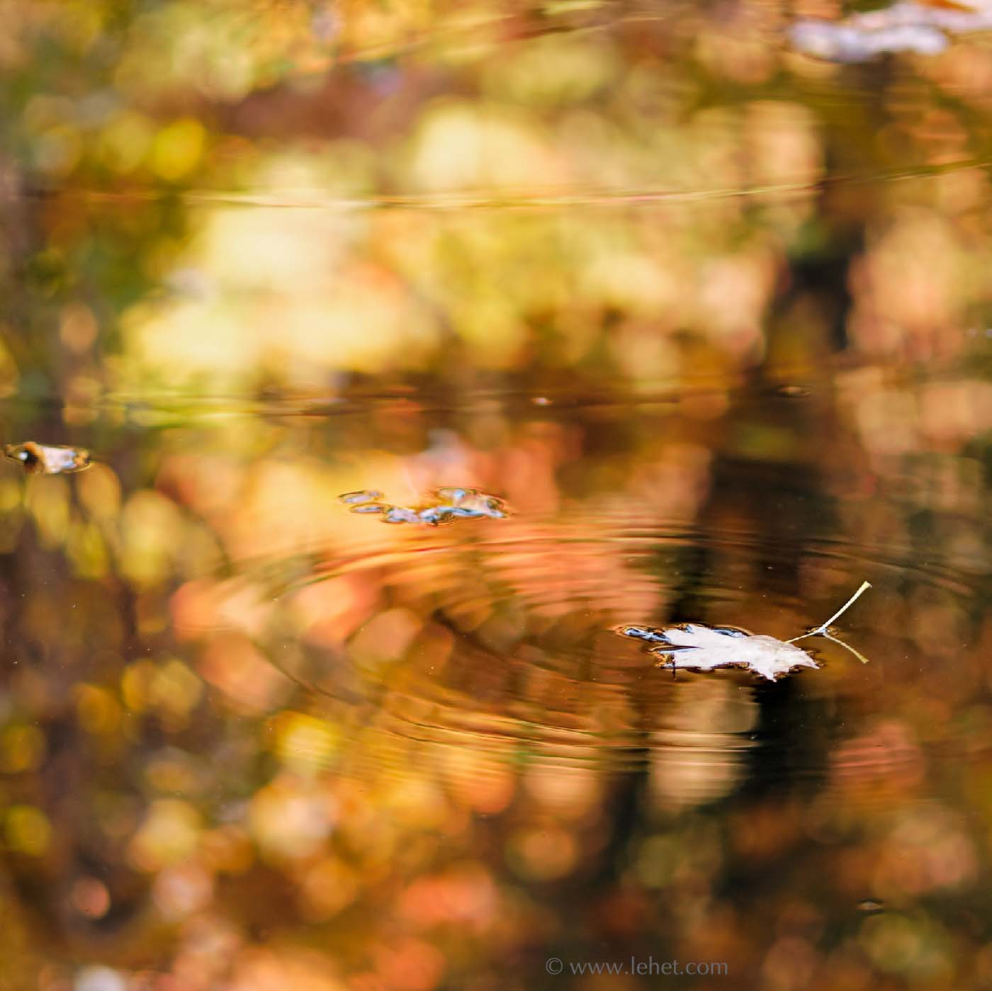
Another iPad Screen, a little late for seasonal use this year. This fits into my ideal of a photographic ipad home screen: it shouldn’t interfere with the clarity of the app icons; it should be interesting and perhaps colorful; it should have some not-in-the-way element that is clearly photographic. Often a shallow depth of field image will work for these goals.

As always with these iPad posts, email me if you’d like an iPad resolution copy.

The obligatory musings: This image was actually flipped horizontally, just for the purpose of iPad screen goodness. In fact, I think it does help the composition. If you keep each of your screens with a free spot, a missing app icon or two, the leaf will show up in the empty corner.

The funny thing is that now in the digital era, when it’s so easy to do things like this, I very rarely do flip images. I tend to try to cling to some sense of reality, now that reality is so malleable by digital means.

In the old days, by contrast, I used to do that in the enlarger. When I saw a composition on the ground glass of my 4×5 view camera, it was upside down and backwards. This actually helped develop my eye for abstraction. Often I would get excited about an exposure, but then I would find it just didn’t “move” the same way (the flow of the eye through a composition) as when I envisioned it, focusing on the upside down and backwards image. Upside down never worked, of course, and I didn’t go there. But sometimes flipping horizontally worked. I can’t think of any of my currently published online images that are flipped, but some of the film work might be.

This print is for sale here.

Beech Leaf in Snow, 2012

Beech Leaf in Snow

It’s been a funny winter here in Vermont. Frost came late, bitter cold came not at all, more rain and ice than snow, and now it seems we’re already turning the corner toward mud season.

Through it all there has been a skim of snow. One thing that has been catching my eye is the way the late-falling and blowing leaves settle on the crust and then melt down into it. Pretty cool.

I haven’t printed this yet, and it doesn’t work as well full-screen on the monitor (but it is cool way huge). I’ve had it as the background for the home screen on the ipad for some time now, and I just love it there. Hopefully it will come through well at this size and context too.

This print is for sale here.

Phyla of Joy Book Cover

Phyla of Joy Book Cover

I’m flattered that Tupelo Press chose this image for the cover for this book of beautiful poems.

Not only that, but there are other books in the winter spring catalog using my photos too.

As a photographer, I usually don’t mess with the orientation of images, and I only crop if it really helps. But I also like to support creative designers. In this case I’m glad the designer took liberties with the orientation of the image. My original is here. He rotated my horizontal by 90 degrees clockwise and fit the text into the curve. Success!

And then they used it again for the catalog cover. Upside down this time. But you know, it’s better that way, maybe. The catalog cover is here:
Tupelo Press Cover

Blue Tailed Damselfly 2008

I think this is a Blue Tailed Damselfly, Ischnura elegans. If anyone knows better, feel free to let me know.

This weeks post is a meditation on image size, among other things. I’m finding the iPad to be really helpful in giving a fresh view of images, and I think especially for images that should not be seen at a large size.

Photography is funny; on the one hand we’ve got a two dimensional image that need to live and die by what happens in that flat space. On the other hand, the image is tied to something we might see in the so called real world. And it does seem often that an image won’t work if represented larger than real life — but then again it can, and sometimes it’s better for it. But I’m finding that in looking through photos in Lightroom on the big and oh so beautiful monitor, that some look worse at that size and in that space than they do on the iPad. Of course I can give a long rant about trying to use the iPad for photography, when images are inconveniently de-coupled from the concept of files. It’s impossible to find the damn image to actually work with it or print it in full resolution or anything. What a pain!

Some of my images, for instance One Cow, Thirteen Hay Bales; Iceland, really are best at a huge size. That image is all about space, and it helps to really throw some real space into the mix. It should be a big print, about 40″ long. Postcards of Robert Motherwell paintings are a tragic misrepresentation. On the other hand, this image, also sort of about space, seems better when more intimate.
(speaking of space, it turns out that this image doesn’t work as well for me in a tighter frame. There’s something about the insect’s relationship to the space around it that is significant.

I’ll include this in my iPad images collection. If anyone wants an iPad resolution version of an image for a lock screen before I get it together to make an app, please email me.

This print is no longer on the site, but I can print one if you’d like to buy one.

Winter Window 2012

ice on winter window vermont

This is new this week. I glossed over it when reviewing images, but it had enough of a rating to make it onto the for-review files on the ipad. Then it looked so good on the ipad that I decided to try it as a lock-screen image. It looks so good as the lock screen, I had to come here and put it up as photo of the week.

It got me thinking more about photos as something we see differently with different modern viewing methods. It’s a funny thing. While as a fine-photographer I have to take the print, or the possibility of a print, as the basic ground of what makes a “real photograph,” I also have to consider the glowing computer monitor, which is really quite a different thing. And for some reason a smaller hand-held glowing screen is yet another thing altogether. I don’t completely understand why.

I’ve been looking at a number of images as possible iPad-keepers, and it’s interesting. There are certain qualities that make them work for these purposes, lock screen and home screen being quite different. They also need to work when suddenly cropped by an orientation shift. Very interesting.

I’m working on programming an iPad app to present my photos, and this gets me thinking I’ll also need to create an app with images that make good home screen and lock screens for ipads and iphones, and make the app with possibility to get them to the camera roll or photo collection, so they could be used this way by any user of the app. Something interesting to think about, on the back burner.